Real estate in Zürich
the Zürich Statistical Office collects data on the city and its residents. This data is published as Linked Data.
In this tutorial, we will show how to work with Linked Data. Mainly, we will see how to work with the real estate dataset.
We will look into how to query, process, and visualize it.
SPARQL endpoint
Data on the real estate market is published as Linked Data. It can be accessed with SPARQL queries.
You can send queries using HTTP requests. The API endpoint is https://ld.stadt-zuerich.ch/query.
Let's use SparqlClient from graphly to communicate with the database.
Graphly will allow us to:
- send SPARQL queries
- automatically add prefixes to all queries
- format response to
pandasorgeopandas
# Uncomment to install dependencies in Colab environment
#!pip install git+https://github.com/zazuko/graphly.git
import datetime
import re

import pandas as pd
import numpy as np

import plotly.express as px
import plotly.graph_objects as go
from plotly.subplots import make_subplots

from graphly.api_client import SparqlClient
sparql = SparqlClient("https://ld.stadt-zuerich.ch/query")
sparql.add_prefixes({
    "schema": "<http://schema.org/>",
    "cube": "<https://cube.link/>",
    "property": "<https://ld.stadt-zuerich.ch/statistics/property/>",
    "measure": "<https://ld.stadt-zuerich.ch/statistics/measure/>",
    "skos": "<http://www.w3.org/2004/02/skos/core#>",
    "ssz": "<https://ld.stadt-zuerich.ch/statistics/>"
})
SPARQL queries can become very long. To improve the readibility, we will work wih prefixes.
Using the add_prefixes method, we define persistent prefixes.
Every time you send a query, graphly will automatically add the prefixes for you.
Housing prices
Let's find the average price per m2 for an apartment in Zurich. This data is available in the QMP-EIG-HAA-OBJ-ZIM data cube. It will allow us to find the price per city district and apartment type. The data is also available for different points in time.
The query for housing prices in city of Zürich for different districts and apartment types over time looks as follows:
query = """
SELECT ?time ?place ?rooms ?price
FROM <https://lindas.admin.ch/stadtzuerich/stat>
WHERE {
  ssz:QMP-EIG-HAA-OBJ-ZIM a cube:Cube;
             cube:observationSet/cube:observation ?observation.
  ?observation property:TIME ?time ;
                       property:RAUM ?place_uri;
                       property:ZIM/schema:name ?rooms;
                       measure:QMP ?price .
  ?place_uri skos:inScheme <https://ld.stadt-zuerich.ch/statistics/scheme/Kreis> ;
         schema:name ?place .
  FILTER regex(str(?place),"ab|Stadtgebiet vor")
  FILTER (?price > 0)
}
ORDER BY ?time
"""

df = sparql.send_query(query)
df.head()
Prices per apartment type
Let's visualize the housing prices per apartment type. To do this, we will aggregate the prices per rooms.
The cleaned dataframe becomes:
df.place = df.place.apply(lambda x: re.findall('Kreis \d+', x)[0])
df.rooms = df.rooms.apply(lambda x: int(re.findall('\d+', x)[0]))
plot_df = df[["rooms", "price"]][df.time == df.time.max()].groupby(["rooms"]).mean().astype(int).sort_values(by="rooms").reset_index()
plot_df
fig = px.bar(plot_df, x="rooms", y="price")
fig.update_layout(
    title='Housing prices in Zürich',
    title_x=0.5,
    yaxis_title="CHF per m<sup>2</sup>",
    xaxis_title="rooms"
)
fig.show()
Prices per district
Let's visualize the housing prices per district. To do this, we will aggregate the prices per place.
The cleaned dataframe becomes:
plot_df = df[["place", "price"]][df.time == df.time.max()].groupby(["place"]).mean().astype(int).sort_values(by="price").reset_index()
fig = px.bar(plot_df, x="place", y="price")
fig.update_layout(
    title='Housing prices in Zürich',
    title_x=0.5,
    yaxis_title="CHF per m<sup>2</sup>",
    xaxis_title="district",
)
fig.show()
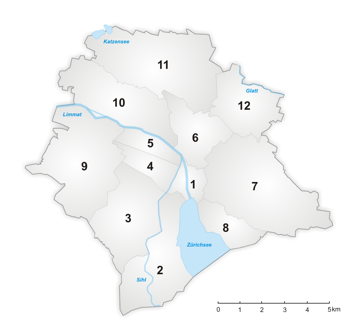
Prices per district and apartment type
Now, let's combine both views. We will visualize housing prices across districts and apartment types.
The dataframe for plotting becomes:
plot_df = df[["place", "rooms", "price"]][df.time == df.time.max()]
plot_df = plot_df[plot_df.rooms <= 4]
plot_df["avg_price"] = plot_df[["price", "place"]].groupby(["place"]).transform(lambda x: sum(x)/len(x))
plot_df = plot_df.sort_values(by=["avg_price", "rooms"])

plot_df.head()
fig = make_subplots(rows=3, cols=4, subplot_titles=plot_df["place"].unique(), shared_yaxes=True, y_title='CHF per m<sup>2</sup>', x_title='rooms', vertical_spacing=0.1)

for i, district in enumerate(plot_df["place"].unique()):

    row = i//4 + 1
    col = i%4 + 1
    subset = plot_df[plot_df["place"] == district]
    fig.append_trace(go.Bar(
        x=subset["rooms"],
        y=subset["price"],
        name=district,
        marker_color=px.colors.qualitative.Dark24[0]
    ), row=row, col=col)

fig.update_layout(height=800, width=1000, title={"text": "Housing prices in Zürich", "x": 0.5}, showlegend=False)
fig.update_yaxes(range=[0,20000])
fig.show()
City districts
Prices over time
Let's take a look at averge housing prices over time. We will aggregate the results by time.
Here is the dataframe and the graph:
plot_df = df[["time", "price"]].groupby(["time"]).mean().reset_index()
plot_df.head()
fig = px.line(plot_df, x='time', y="price")
fig.update_layout(
    title='Housing prices in Zürich',
    title_x=0.5,
    yaxis_title="CHF per m<sup>2</sup>",
    xaxis_title="Year",
)
fig.show()
Prices over time for various apartment types
Now that we have seen the trend, let's dig a bit deeper. We will visualize housing prices over time for 2, 4 and 6-room apartments. To achieve this, we need to reshape our dataframe to show prices per apartment type over time.
The reshaped dataframe becomes:
plot_df = pd.pivot_table(df, index="time", columns="rooms", values="price", aggfunc=np.mean).reset_index()
plot_df.head()
fig = make_subplots(rows=3, cols=1, y_title='CHF per m<sup>2</sup>')

for i, j in enumerate([2,4,6]):

    fig.append_trace(go.Scatter(
        x=plot_df["time"],
        y=plot_df[j],
        name="Rooms: {}".format(j),
        marker_color=px.colors.qualitative.Dark24[i]
    ), row=i+1, col=1)

fig.update_layout(title={"text": "Housing prices in Zürich", "x": 0.5}, showlegend=True)
fig.update_yaxes(range=[8000,14000])
fig.show()
Apartments and population growth
Real estate prices are influenced by:
- Number of available apartments
- Number of people willing to buy a an apartment
Let's take a look at how those numbers evolved over time. Mainly, we want find the apartments and population count in city of Zurich.
The query for the number of inhabitants and apartments over time looks as follows:
query = """
SELECT *
FROM <https://lindas.admin.ch/stadtzuerich/stat>
WHERE{
    {
      SELECT ?time (SUM(?pop_count) AS ?pop)
      WHERE {
        ssz:BEW a cube:Cube;
                   cube:observationSet/cube:observation ?obs_bew.
        ?obs_bew property:TIME ?time ;
                 property:RAUM ?place_uri_pop;
                 measure:BEW ?pop_count .

        ?place_uri_pop skos:inScheme <https://ld.stadt-zuerich.ch/statistics/scheme/Kreis> ;
                   schema:name ?place_pop .

        FILTER regex(str(?place_pop),"ab|Stadtgebiet vor")
      }
      GROUP BY ?time
    }
    {
      SELECT ?time (SUM(?apt_count) AS ?apts)
      WHERE {
        ssz:WHG a cube:Cube;
                   cube:observationSet/cube:observation ?obs_apt.
        ?obs_apt property:TIME ?time ;
                 property:RAUM ?place_uri_apt;
                 measure:WHG ?apt_count .

        ?place_uri_apt skos:inScheme <https://ld.stadt-zuerich.ch/statistics/scheme/Kreis> ;
                   schema:name ?place .

        FILTER regex(str(?place),"ab|Stadtgebiet vor")
      }
      GROUP BY ?time
    }
}
ORDER BY ?time
"""

df = sparql.send_query(query)
df.head()
fig = make_subplots(specs=[[{"secondary_y": True}]])

fig.add_trace(
    go.Scatter(x=df["time"], y=df["pop"], name="Population"),
    secondary_y=False,
)

fig.add_trace(
    go.Scatter(x=df["time"], y=df["apts"], name="Apartments"),
    secondary_y=True,
)

fig.update_layout(title={"text": "Population and Apartments in Zürich", "x": 0.5})
fig.update_yaxes(title_text="population", secondary_y=False)
fig.update_yaxes(title_text="apartments", secondary_y=True)
fig.show()
Apartment types over time
Let's take a look at what apartments were, and are available in Zurich. How did the share of various apparmnent types evolve over time?
Is there a trend to build more smaller (or bigger) apartments?
These insights are available in the WHG-ZIM data cube.
The query for the number of different apartment types over time looks as follows:
query = """
SELECT ?time ?rooms (SUM(?count) AS ?apts)
FROM <https://lindas.admin.ch/stadtzuerich/stat>
WHERE {
  ssz:WHG-ZIM a cube:Cube;
             cube:observationSet/cube:observation ?obs.
  ?obs property:TIME ?time ;
           property:RAUM ?place_uri;
           property:ZIM/schema:name ?rooms ;
           measure:WHG ?count .

  ?place_uri skos:inScheme <https://ld.stadt-zuerich.ch/statistics/scheme/Kreis> ;
             schema:name ?place .

  FILTER regex(str(?place),"ab|Stadtgebiet vor")
  FILTER (?time >= "1977-01-01"^^xsd:time)
}
GROUP BY ?time ?rooms
ORDER BY ?time ?rooms
"""

df = sparql.send_query(query)
df.head()
Let's reshape our dataframe to show the apartment count per apartment type, over time:
def rename_rooms(x: str) -> str:

    elements = x.split("- und ")
    if elements[1] == "mehr-Zimmer Wohnung":
        return elements[0] + "+"
    else:
        return elements [0]


df.rooms = df.rooms.apply(rename_rooms)
df = pd.pivot_table(df, index="time", columns="rooms", values="apts")

# Data cleaning
df["5+"][df["5+"].isna()] = df["5"][df["5+"].isna()] + df["6+"][df["5+"].isna()]
df = df[["1", "2", "3", "4", "5+"]].reset_index().rename_axis(None, axis=1)
df = df.fillna(method="ffill")
df.head()
cols = ["1", "2", "3", "4", "5+"]
start = df[cols].iloc[0] / sum(df[cols].iloc[0])
end = df[cols].iloc[-1] / sum(df[cols].iloc[-1])
diff = abs(end-start)
cols = [x for _, x in sorted(zip(diff, cols))]

fig = px.histogram(df, x="time", y=cols, barnorm="percent")
fig.update_layout(
    title='Apartments in Zürich',
    title_x=0.5,
    yaxis_title="Share of apartments in %",
    xaxis_title="Year",
    legend={"title": "Rooms"}
)
fig['layout']['yaxis']['range'] = [0,100]
fig.show()